This may look like the sleep site, but it's not.
The information below was part of a project submitted to WGU Teachers College. If you're interested in how this site was made, feel free to review the information below. Otherwise, use the navigation links to return to the sleep site. Thank you!
Graphics
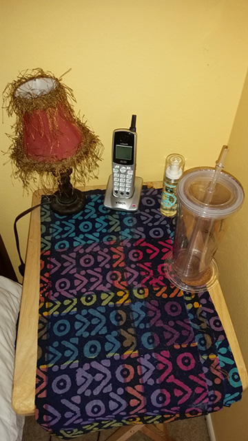
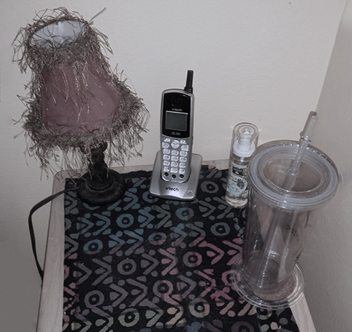
A) Original photo, resized. This photo was selected to convey the creation of a positive sleep environment with easy access to water, light, soothing scent, and a phone (which will be noted as having the ringer turned off).
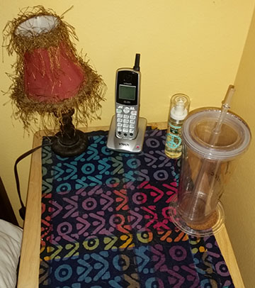
B) Original photo, cropped to remove excess space above and below picture.
C) Original photo, adapted to allow more breathing room (space) to left and right of image, which necessitated erasing the bed from the picture. Additionally, the colors have been muted so as to match the website color scheme better.
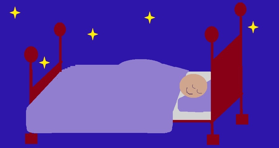
D) Original graphic used as a lower frame for the web pages. Intention was to mirror the gently humorous tone of the website, while also reinforcing positive sleep habits by reminding users of bedtime-related items (stars, beds, sleeping). Here resized as per task requirements.

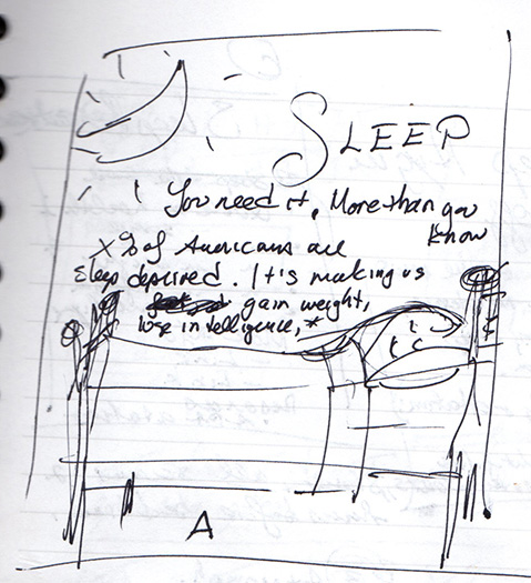
E) Scanned document, cropped and resized. Document was not be used in the website itself, but was to demonstrate the design process for both the website and the graphics created.
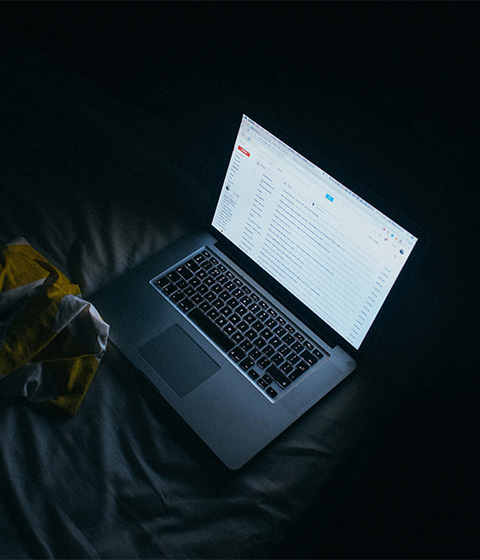
F) Sourced graphic (Wennington, 2014) was selected to reinforce the negative impact of watching screens at bedtime. The dark picture has an ominous tone, with the strong jarring light from the screen conveying the negative message effectively. Additionally, the color scheme would blend well with the website.
Reference
Wennington, J. (2014). [Untitled image of a laptop]. Retrieved January 19, 2016 from https://unsplash.com/photos/loAgTdeDcIU